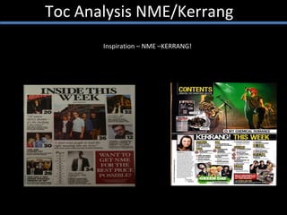
2. Toc Analysis NME/Kerrang I like the use of a different title name rather than just ‘contents…’ I like the use of constant images in the editorial pillars. It will attract the readers, as the consumers will want to see what is inside. I like the page number on the image because it is a clever and more attractive way to tell the consumer where the article is. An advert box is clever as it allows the magazine to attract more information to the readers and consumers. It has a consistent colour theme which I would use in my magazine as it looks more professional. The use of a pull quote interests the reader, and makes them want to find the article. I like this ‘plus’ pillar as it is different and unique, it’s very clever and allows the reader to see and read more information in a small compact place.
3. Toc Analysis NME/Kerrang The use of a editors note is clever as it adds to the professional look. The collage of pictures is clever as it is more interesting and enticing for the reader. The use of Adding there name in the TOC, encourages their brand identity. The articles and page numbers of it are very clear and precise which is easier for the reader to read. Having the biggest image for biggest article is clever as it draws us readers/consumers to that article. Again Kerrang has consistent colour scheme which is more appealing for the reader as with a constant scheme it looks more professional therefore more eye-catching.